Spoonflower and Redbubble Fabric Designs
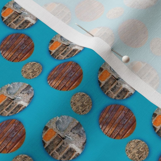
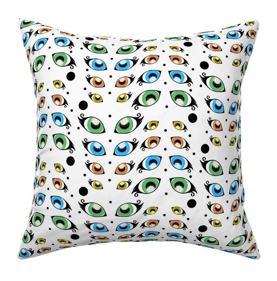
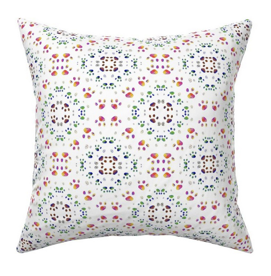
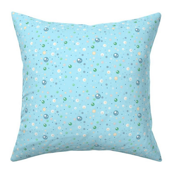
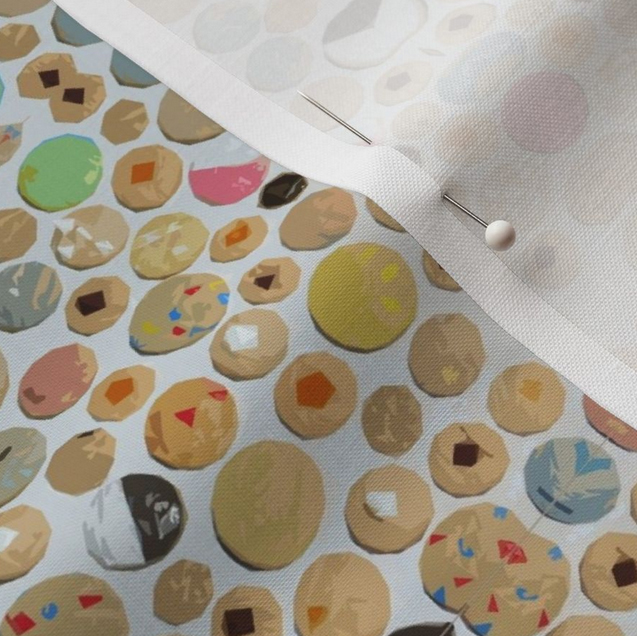
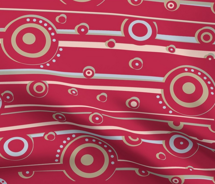
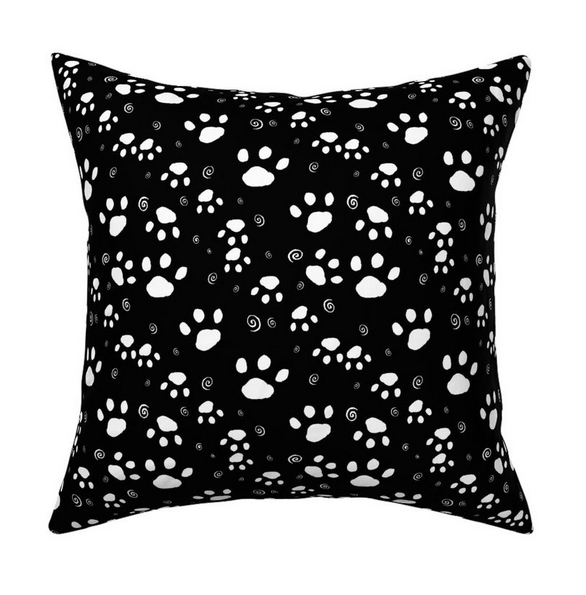
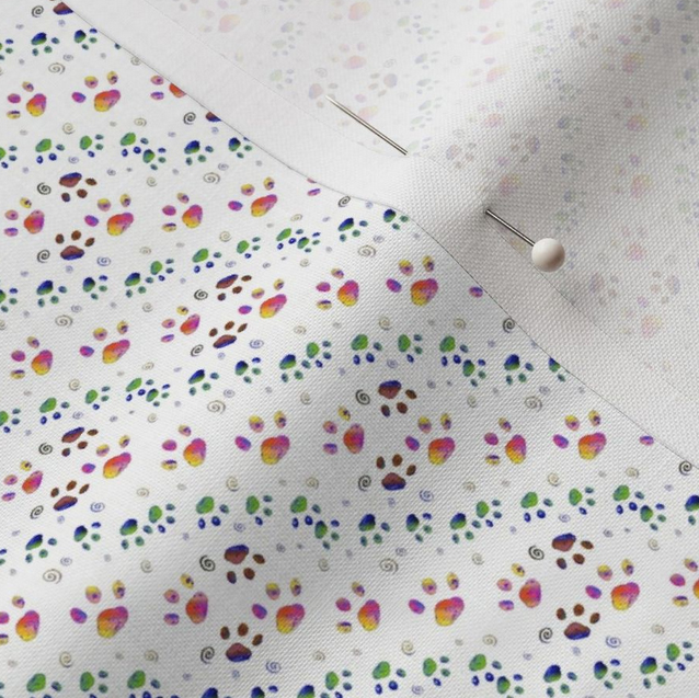
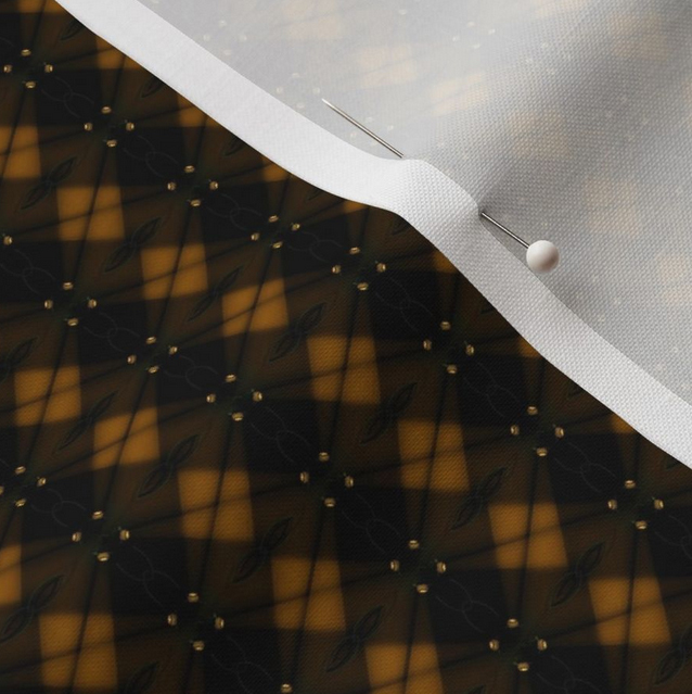
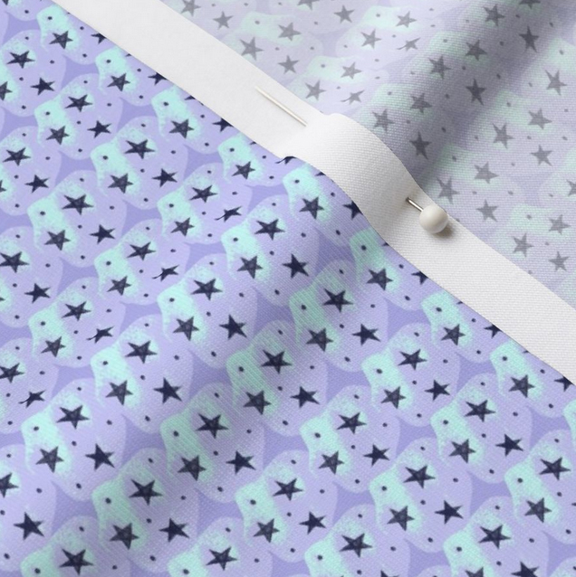
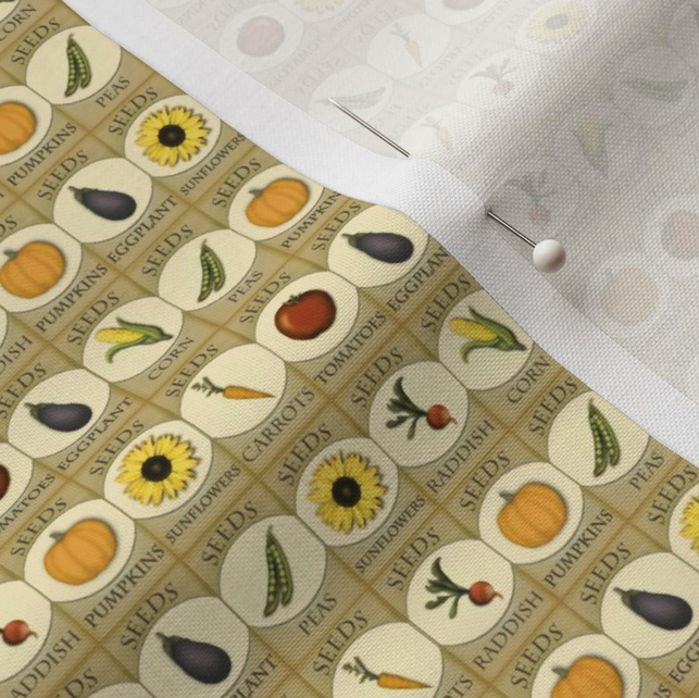
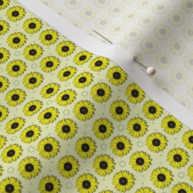
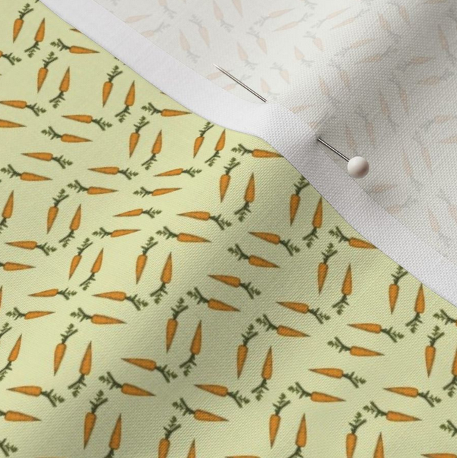
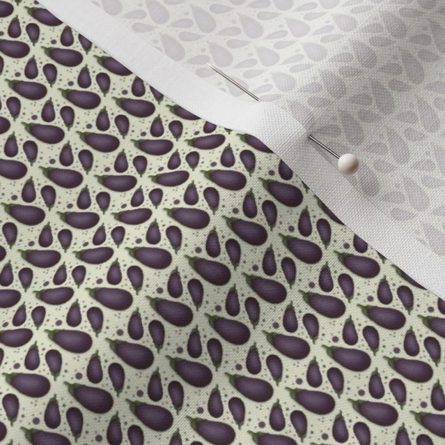
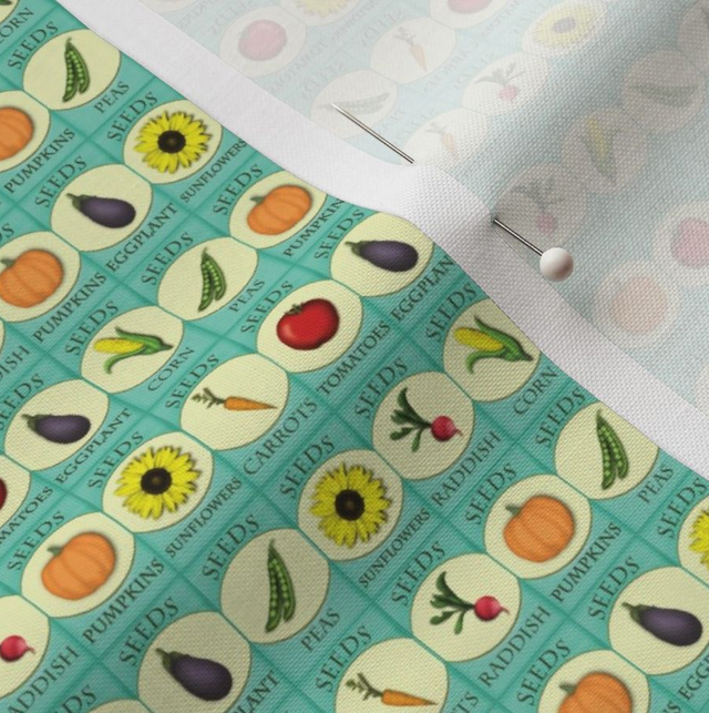
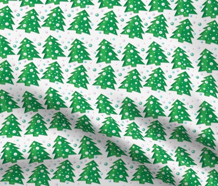
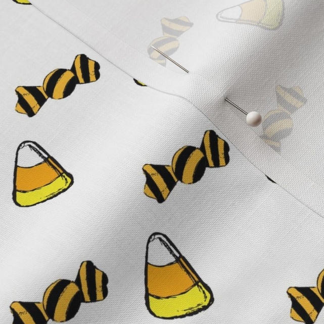
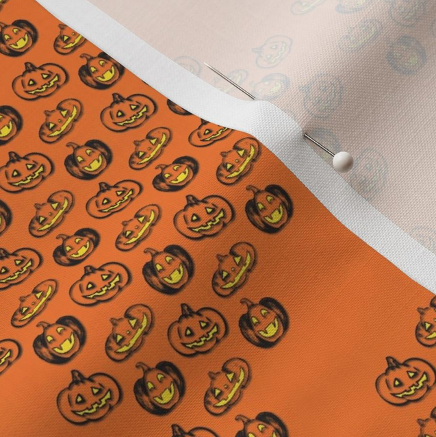
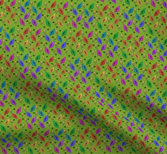
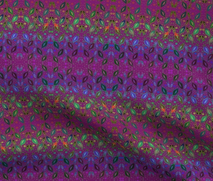
Some of my favorite fabric designs. Visit Spoonflower to see more.
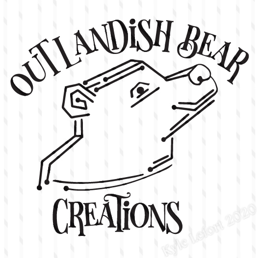
Black & white logo design for a small business specializing in 3D printing and fabrication. This client specifically requested a bear but also wanted the logo to have a tech theme, so this design referenced a circuit board for the line art arranged to give it more of a dimensional feel.
(Logo was recently created and still being implemented by the client, so it is heavily watermarked here)
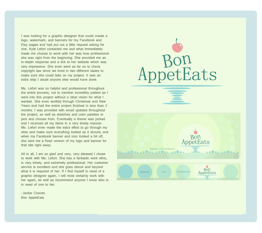
Logo and web banner designs for “Bon-AppetEats”, a small artisan craft business specializing in miniature polymer clay food sculptures and food themed jewelry.
Portfolio work shows original set of designs. Some additional design work and revisions were made at later dates to help match the branding to the client’s evolving business.
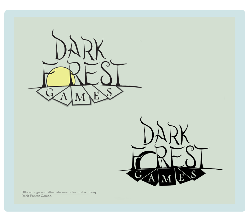
Original logo design, one color screen print ready logo rework, and business card for, “Dark Forest Games”, a table gaming shop specializing in “Magic the Gathering” card game sales, trades, and tournaments.
The upper half of the logo uses hand drawn type and is meant to evoke the sense that you are in a ‘dark forest’ with a full moon on the rise, while the lower half uses a simple serif font over top of abstracted shapes representing playing cards as a subtle visual description of exactly what kind of gaming potential customers can expect.
~ Due to a quick initial start up the clients in this case chose to use the original full color logo prior to the finalizing of a design that could hold up as a dynamic one color or black and white design. When it came time to start selling t-shirts at their store using the logo, I was contacted to come back and continue working on design revisions so that the logo could be screen printed in all black or all white. Past and current store owners seem to use both designs interchangeably as a logo now.
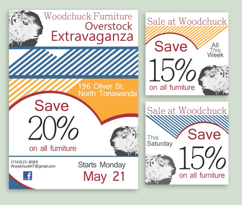
Web and print ad designs for Woodchuck Furniture, Lighting, and Design – 2012 branding.
This multi ad design had to be eye catching in both black & white, as well as in color. It needed to work well in print and stand out on their Facebook timeline.
Incorporating the bright colors they used in their store windows, along with their woodchuck image/logo, I used a combination of lines and shapes to quickly highlight important information. I also made it so that the color and general orientation of the design elements could be rearranged to help maintain visual interest. This helped the store avoid having to do a complete redesign for every sale.
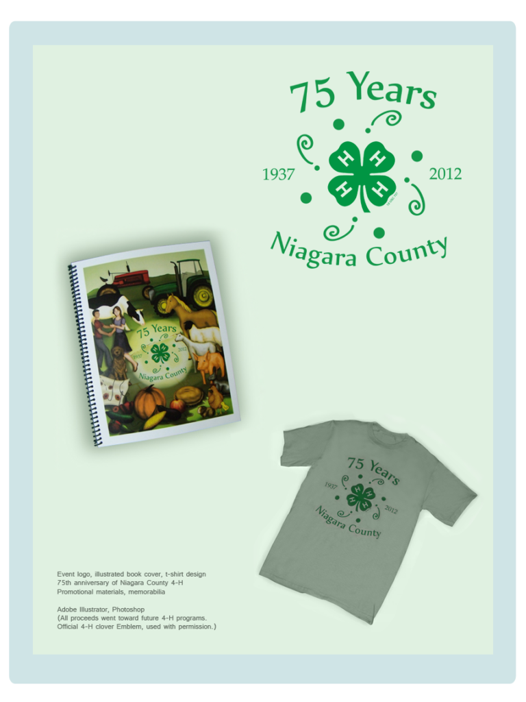
Working as a Graphic Designer within a larger committee, developed an event logo incorporating the official 4-H emblem (used with permission), which then led to illustrating the front cover for the memorial event book.
Committee Responsibilities included: Attending monthly meetings during the year long Anniversary prep, Receiving and incorporating committee feedback/ideas for design work, Managing the pre-order first print run of event t-shirts, and Working with the committee to accomplish other event tasks as needed throughout the year.
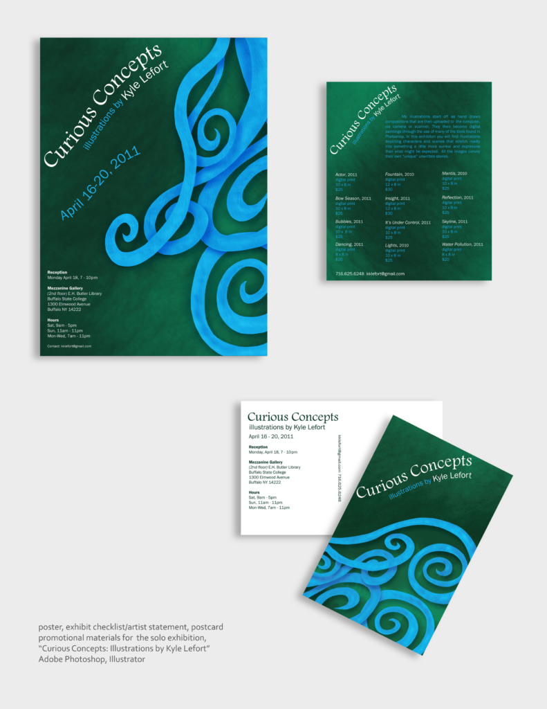
Promotional materials for “Curious Concepts ~ Illustrations by Kyle Lefort”
Solo Art Exhibition (2011) featuring 12 original digital paintings depicting an assortment of characters, abstract scenes, and brief visual narratives.
Responsibilities included: Concept development, gallery reservations & setup, illustration, framing, designing promo and show display materials, local advertising and promotion, art print sales.
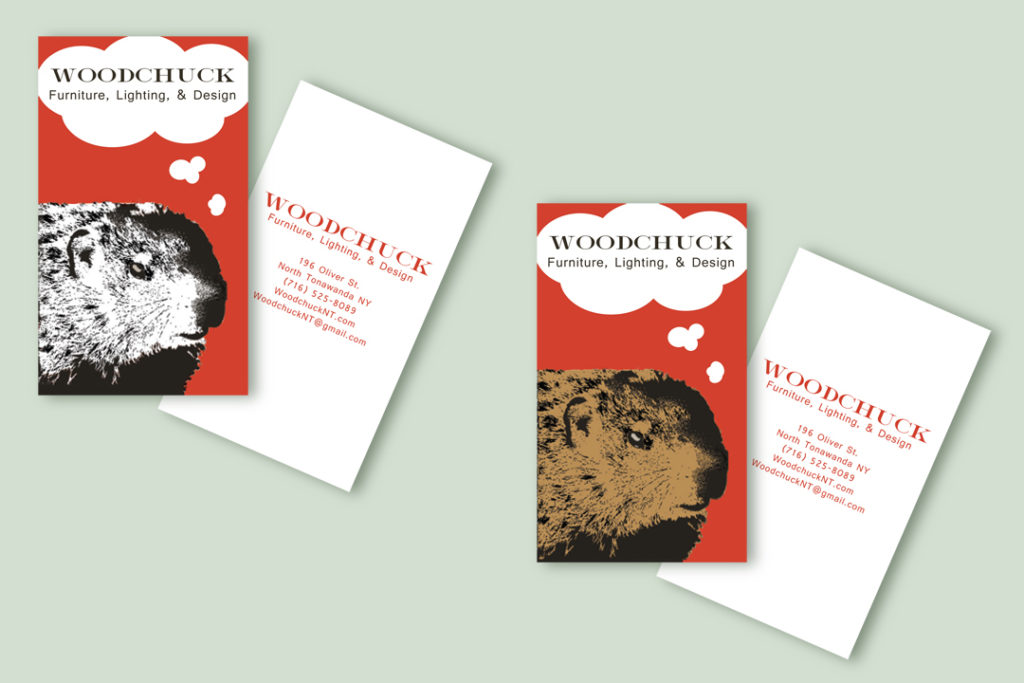
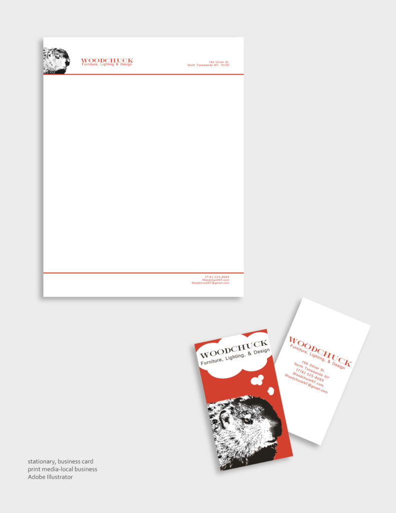
Business card and stationary design for Woodchuck Furniture, Lighting, and Design – 2010 branding.
I was provided with the black and white Woodchuck image which the company used in place of a logo.
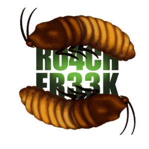
Logo/Avatar design for,”R04CH FR33K”.
In this instance my client was an individual who wanted a logo/avatar to help establish their web identity as an insect enthusiast, primarily cockroaches.
Hand drawn, type done in Illustrator, colored/finished in Photoshop.
Concept Logo Design for “SeaScape”, a beachside resort along the Red Sea in Egypt.
Shapes and color scheme were in coordination with the already established main building of the resort, with the color red being used to highlight the fact that the resort was along the coast of the ‘Red Sea’.
Concept Logo Design for “Urban Eyes”, a Seattle based retail store specializing in glasses and sunglasses.
Concept Logo Design for “Sound Blender”, a recording studio.
Final design is combination of sound waves and the whirlpool motion of a blender, abstracted.
